


Neptune Club Bratislava
A guest picks a VIP box by clicking the floor plan
Neptune Club Bratislava needed one place where a guest could see the programme, listen to the residents and hold a table. We designed and built the public site: six sections, full route-based bilingualism, and an interactive floor plan that turns eleven VIP boxes into a booking flow.
Programme, residents, floor plan, reservation. Two languages, one site, in production.
01The challenge
Where it started.
A club night was announced in social posts and nowhere else. That works for the people who already follow the club and fails for everyone else: there was no single place to check who is playing this weekend, when the doors open, or whether a table is still free. Every question of that kind arrived as a direct message and was answered by hand.
In detail
Reserving a VIP box is the part that a form cannot express well. A guest does not want box number seven, they want the box above the stage on the left. A dropdown with eleven numbers hides exactly the information that decides the booking, and the staff then spend the conversation explaining where each number actually is.
The audience is not only Slovak. A club in the centre of Bratislava is read by visitors who do not speak the language, so the site had to be genuinely bilingual, every string in both, rather than a Slovak site with an English homepage.
Quote
“A guest does not want box number seven. They want the box above the stage on the left. So the plan had to be the form.”
02What we built
The product, screen by screen.
The design principle throughout: everything a guest needs before the night should be answerable without writing to anyone.
The product
Live at neptune.elevon.io
Two screens from the live site: the entry point, and the reservation flow where the floor plan does the work of a form.
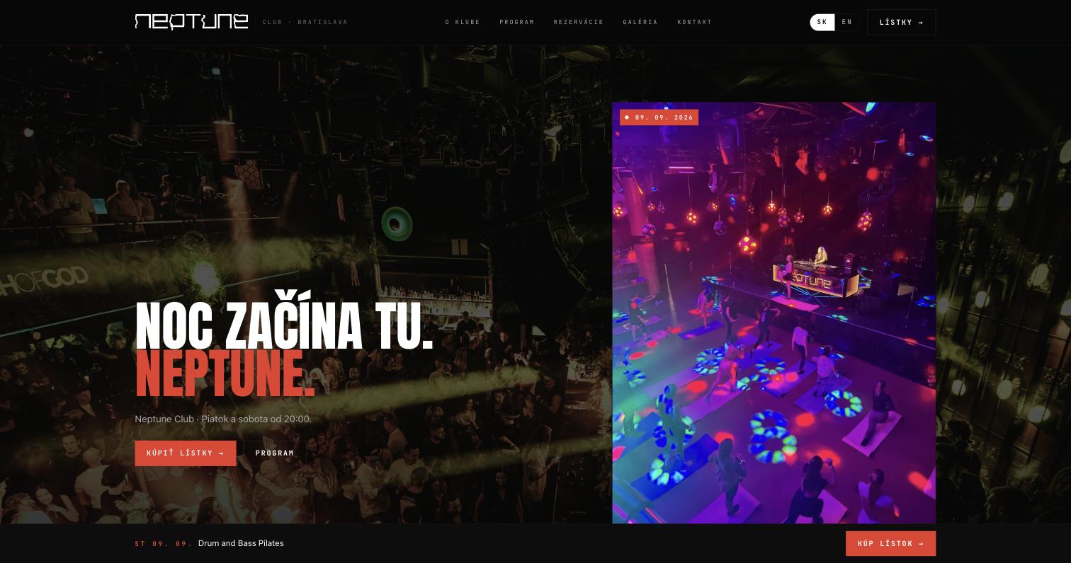
The night starts here: headline, tickets, next event 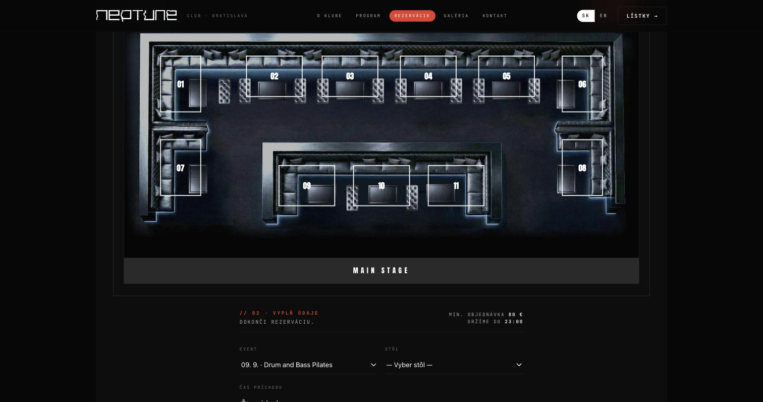
Eleven numbered VIP boxes above the stage
Captured from the live site in September 2026. Slovak interface, one of two languages.
Why this design
The floor plan is the booking form
Guests reserve one of eleven VIP boxes by clicking it in the Mainstage layout, with availability shown per event and the booking rules stated next to the plan. Confirmation arrives by email; the rest of the tab is settled at the bar, which is how the club already works.
Bilingual by route, not by exception
Localization is driven by the URL (/sk, /en) and covers every string: headlines, programme, booking rules, newsletter. The switch sits in the header, so a visitor never lands on a half-translated page.
Consent first, analytics second
The newsletter uses double opt-in for presale drops and lineups, and Plausible analytics only start after cookie consent. No tracking pixels, which for a venue collecting a subscriber list is the difference between a clean list and a liability.
03Rollout
Step by step.
The site is one flowing public page with six sections, programme, residents, about, VIP boxes, contact and gallery, plus a separate reservation flow. The identity is deliberately dark and high contrast: a black canvas, bold display type and a single hot orange accent, so the screen reads like the room.
How it runs
Ticketing stayed where it was. The club already sells through an existing tool, so the site does not replace it: it owns discovery, reservations and the subscriber list and hands the visitor over for the ticket itself. That kept the build small and the operation unchanged.
In practice
A guest opens the programme, sees which stage the night runs on and when the doors open, listens to the resident on Spotify, finds the door on a real map, and reserves the box above the stage by clicking it. Nobody at the club answers a message for any of that.
04Results
What changed.
Running in production. What the site does today.
- Eleven bookable VIP boxes, reserved by clicking the Mainstage floor plan
- Full SK and EN localization on every string, switched from the header
- A rolling weekend programme with stage and genre tags and door times
- Resident, headliner and guest profiles with direct Spotify links
- An interactive OpenStreetMap map with one-tap directions
- Double opt-in newsletter and consent-gated privacy-first analytics
Why it worked
The reservation was designed as a picture rather than a field. Once the plan is clickable, the guest and the staff are looking at the same thing, and the conversation that used to explain where box seven is does not happen at all.
We left ticketing alone. Replacing a working sales tool would have doubled the scope and changed how the club operates on a Friday night, for no benefit to the guest. Drawing the boundary there is why the site shipped as a small, finished product.


Next step
Your process could be the next case.
A 30-minute call. You tell us about one process, and we say whether it fits the platform, a product build or a consulting project.